Member for
11 years 10 monthsNote: This post is also featured on my blog: Flash of the Hand
Every year the North Bennet Street School hosts an exhibit to celebrate the work of current students and alumni across several of its departments, which include Bookbinding, Violin Making, Jewelry, Cabinet and Furniture Making, and Preservation Carpentry. The exhibit opened on May 10th and runs through the end of the month. The opening reception will take place on the evening of Tuesday, May 13th for the Annual Evening of Craft when supporters of the school and exhibitors come together to discuss and explore the handcrafted items.
As an exhibitor this year, I had the opportunity to help set up the show, which allowed me to document and chat with each of the graduating students about their fine bindings. The photographs in this post were taken during the set-up, so please excuse the occasional body in the background or roll of blue tape.
Dirck de Bray: A Short Instruction in the Binding of Books was chosen as this year's set book for the graduating bookbinding class. The earliest known Dutch bookbinding manual is a tiny illustrated manuscript from 1658, in which, Dirck de Bray described the making of a full leather binding and a parchment laced-case binding as the most common techniques of the 17th century. The manuscript is illustrated with 16 instructive drawings in pen and watercolor. This 17th century bookbinding manual originally appeared for the public in a 1977 edition, which has been re-edited in the 2012 edition that the students bound. This second edition includes each original page from the 1658 manuscript along with an in-depth look at the life of Dirck de Bray and the time period he lived in, as well as, the way books would normally look, the master's test for bookbinders and other early manuals.
The 2012 edition was printed in an unusual oblong format to include the historical Dutch paired with a contemporary Dutch and English translation next to the original page from the 17th century manuscript. I asked each of the graduating students to share with me their concept for their design.
Alcamy Henriksen
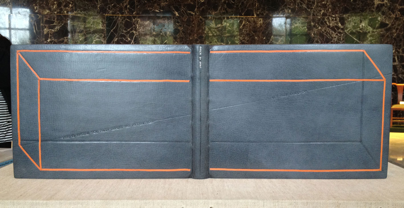
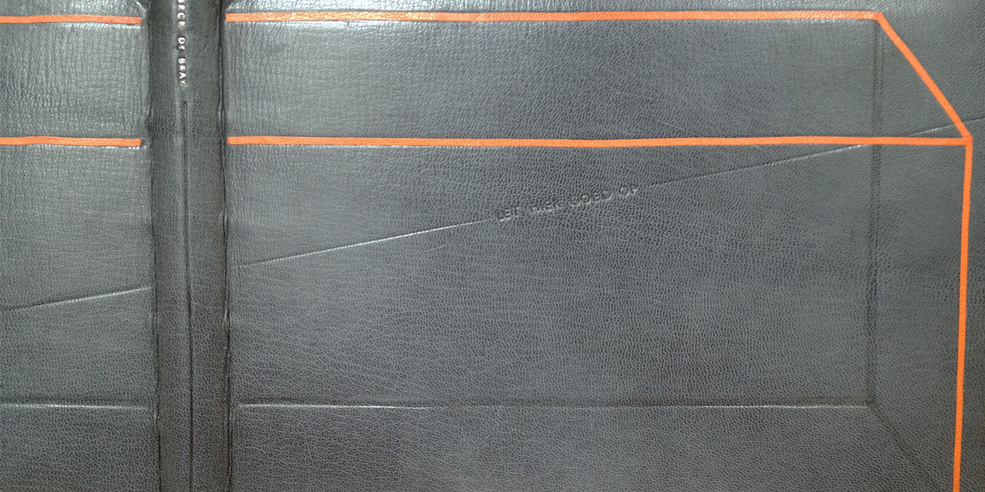
As I mentioned above, the set book was written in both Dutch and English. Alcamy ran with this theme by including a phrase from the text: "This is where you must really pay attention" is blind tooled on the back cover, while "Let hier goed op" is the Dutch translation blind tooled on the front cover. These two phrases are enclosed within a box created through the use of orange onlays.
Dirck de Bray was a talented artist across several mediums, but principally known for his paintings and worked on the murals of "Orange Hall" (Oranjezaal) in Huis ten Bosch, a royal palace in The Hague. The orange cube spanning across the covers represents the space of the artist's creavity and its challenging limitations.
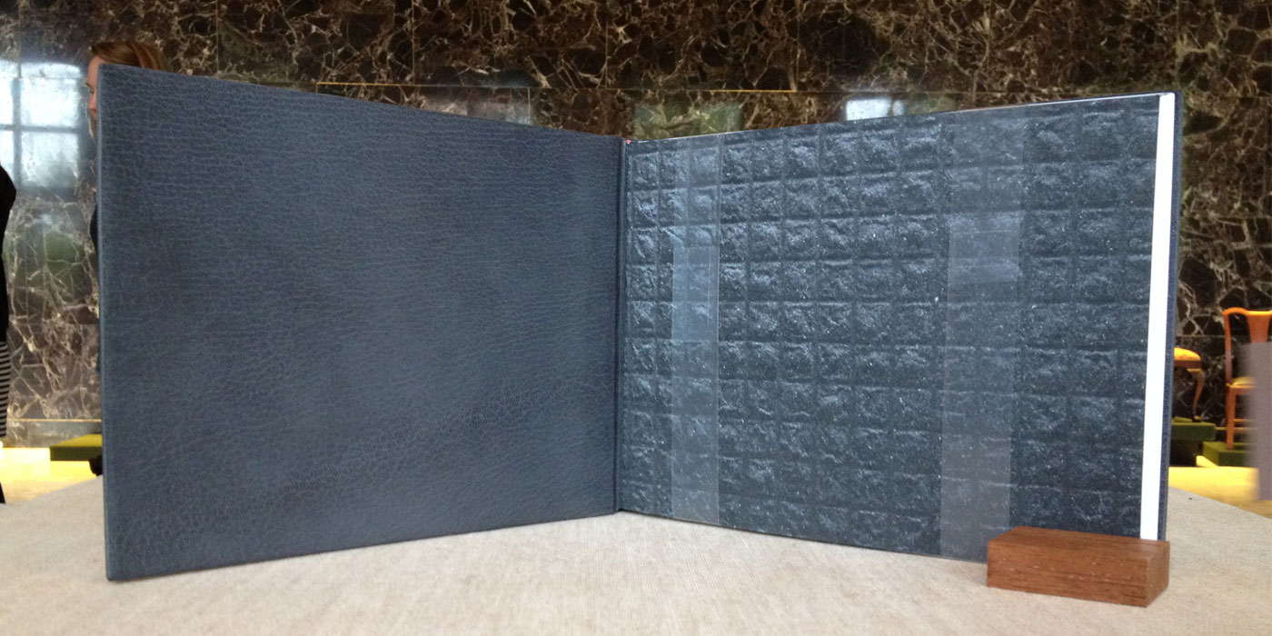
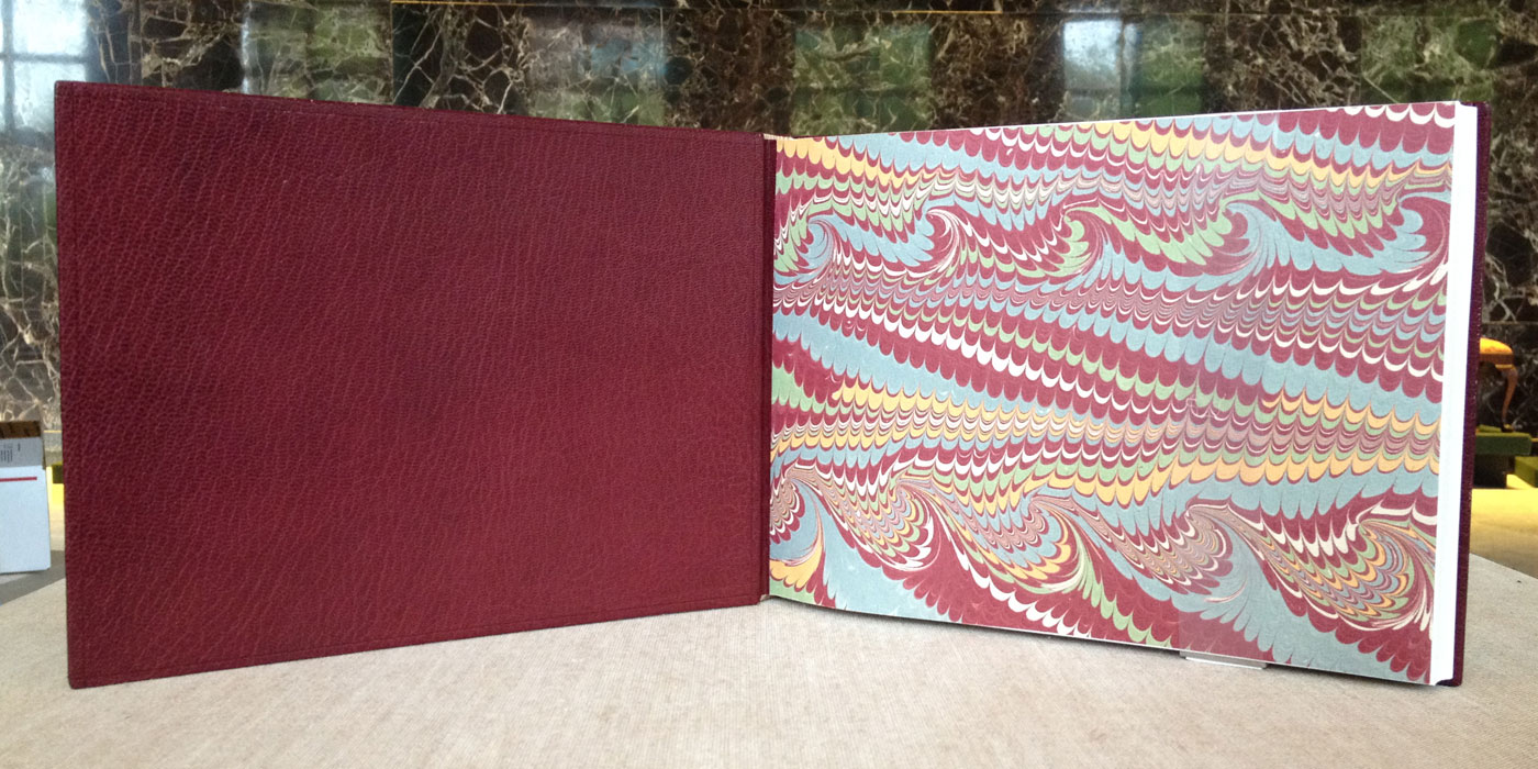
Alcamy's binding is bound in gray Harmatan goatskin with matching leather doublures. She used handmade papers from Hook Pottery Paper as the made flyleaf. The head edge is decorated with graphite with a single line of orange running the length of the edge. Alcamy's design is really striking and made great use of long horizontal shape of the binding.
- - - - - - - - - - -
Christine Ameduri
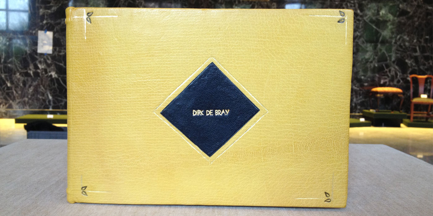
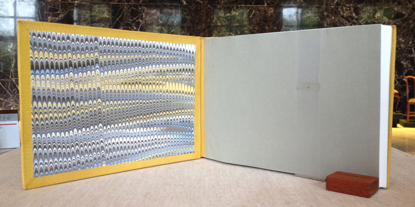
Inspired by 17th century Dutch tile designs, Christine reinterprets the design as a broken frame of simple corner ornaments. The intersecting gilt lines at each corner are paired with two small smoke-tooled droplets. The center tile is a black onlay tooled with de Bray's name and framed within gilt lines. Bound in yellow Harmatan goatskin with matching leather hinges. Inset on the inside of the boards is a panel of handmade marbled paper made by Christine herself.
- - - - - - - - - - -
Gabrielle Cooksey
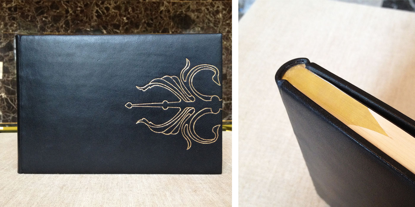
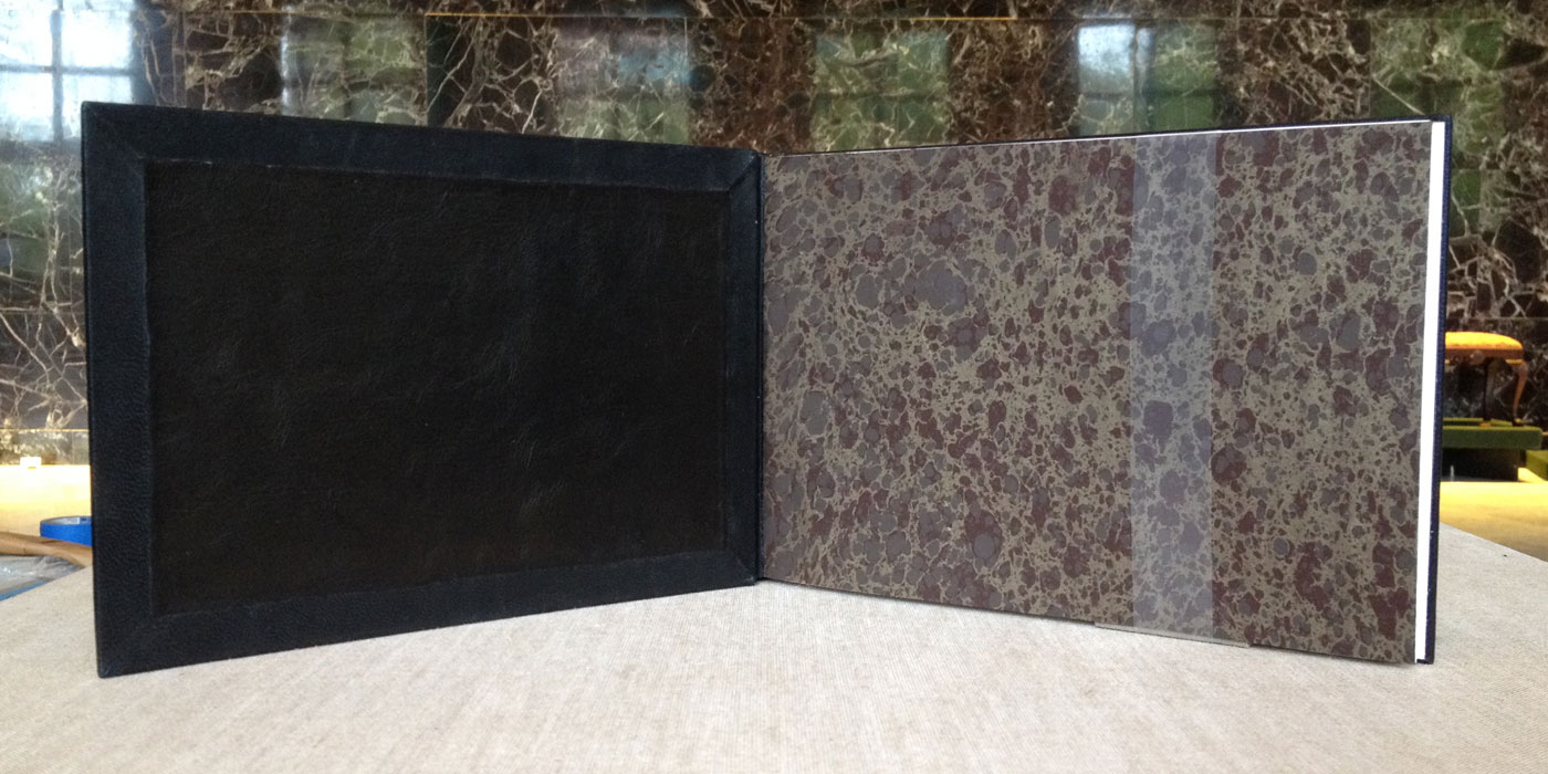
In the classic drawing style that I've seen emerge on Gabrielle's work during her two years at NBSS, she has created an elegant and simple design binding. The motif on the front cover is reflected on the back cover and was created from a series of line palettes and gouges through gold foil. The motif was inspired by Gothic door frames. The edge decoration mimics the shape of the design on the covers.
Bound in dark blue Pergamena goatskin with matching leather hinges. A panel of black leather fills the inside of the boards. The made flyleaf is a handmade marbled paper.
- - - - - - - - - - -
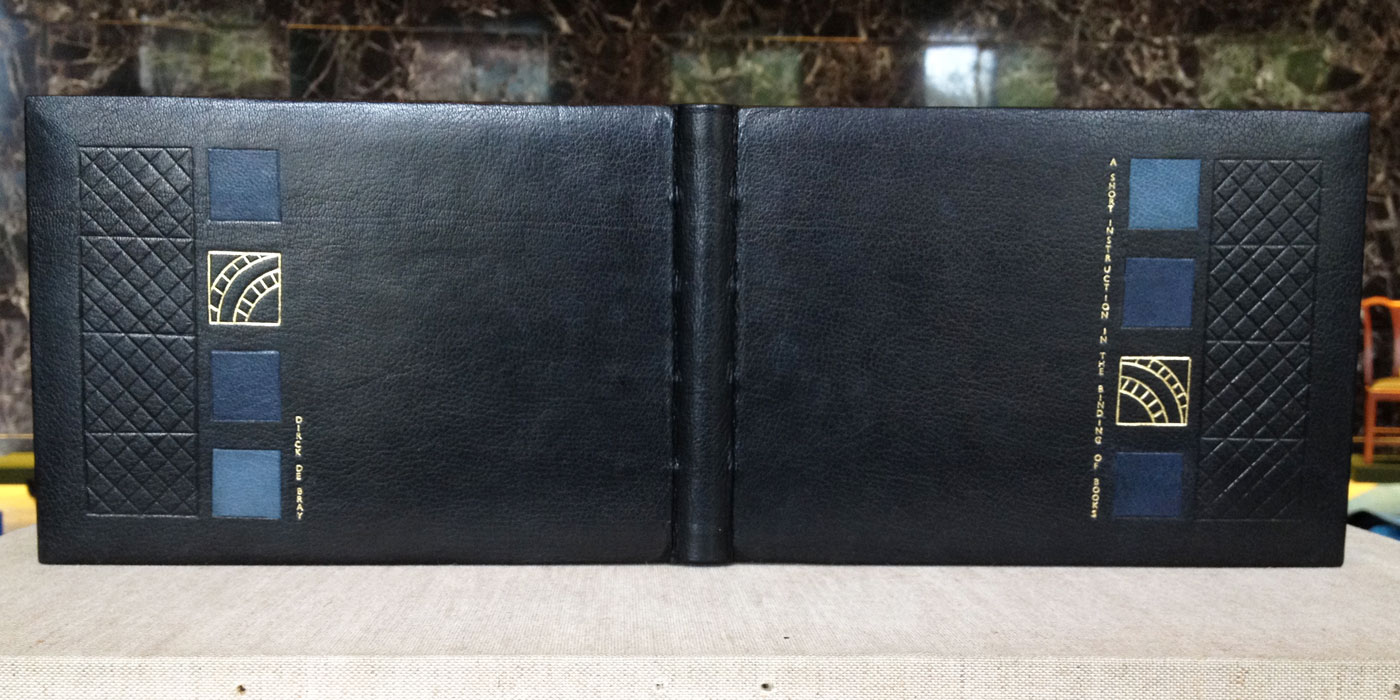
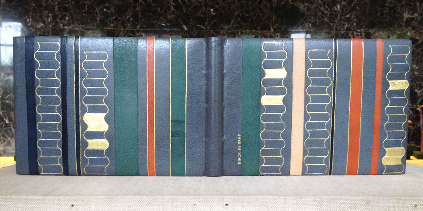
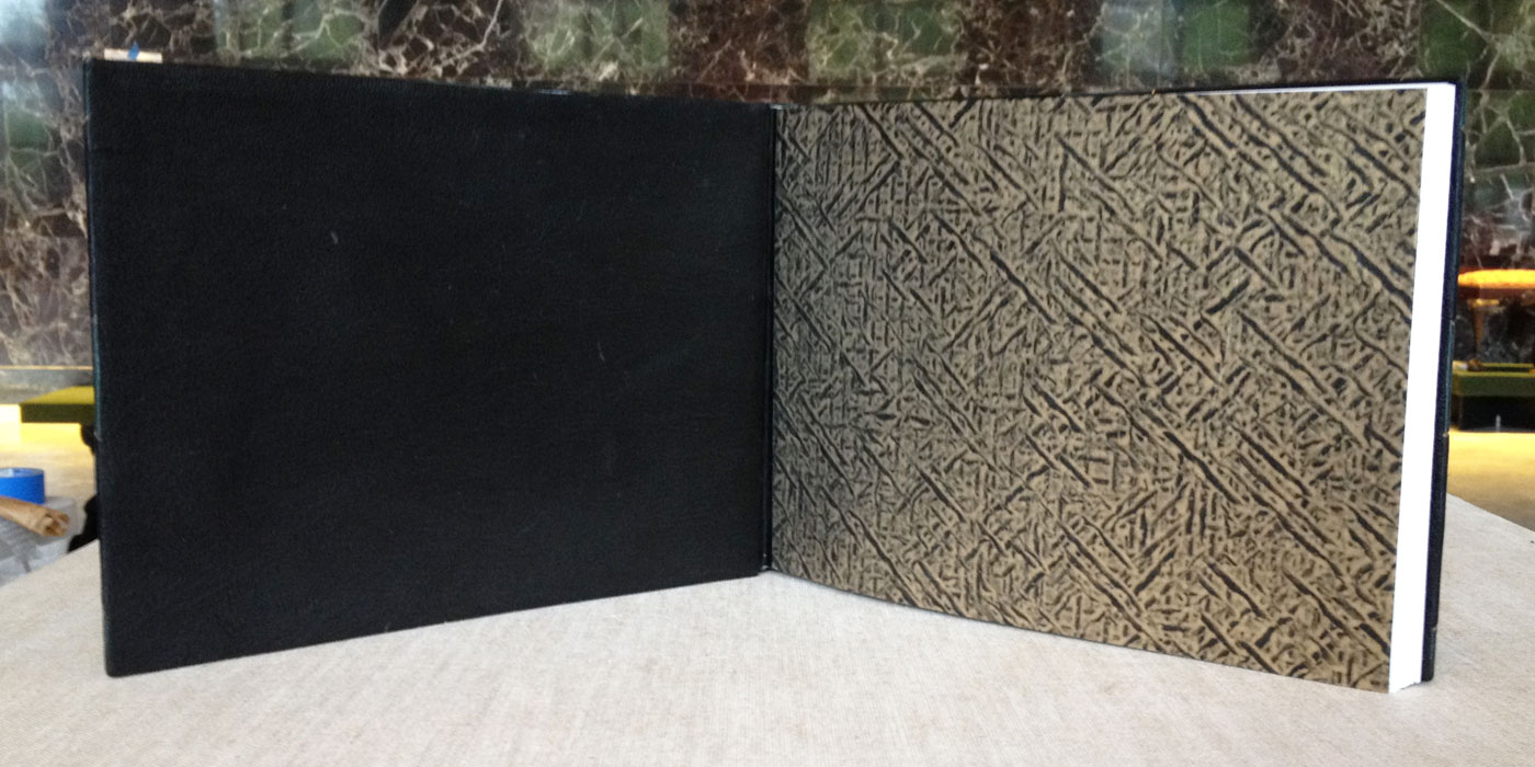
Leslie To
The diaper-style design and onlays of various blue leathers are extracted from the illustrations in the manuscript. de Bray mentions that in art you must look past the surfaces of your surroundings to find the details. Leslie captures the background details of the archways, windows and blue tile flooring through both gilt and blind tooling. The head edge is decorated with green pigment, which is also pulled from the manuscript illustrations.
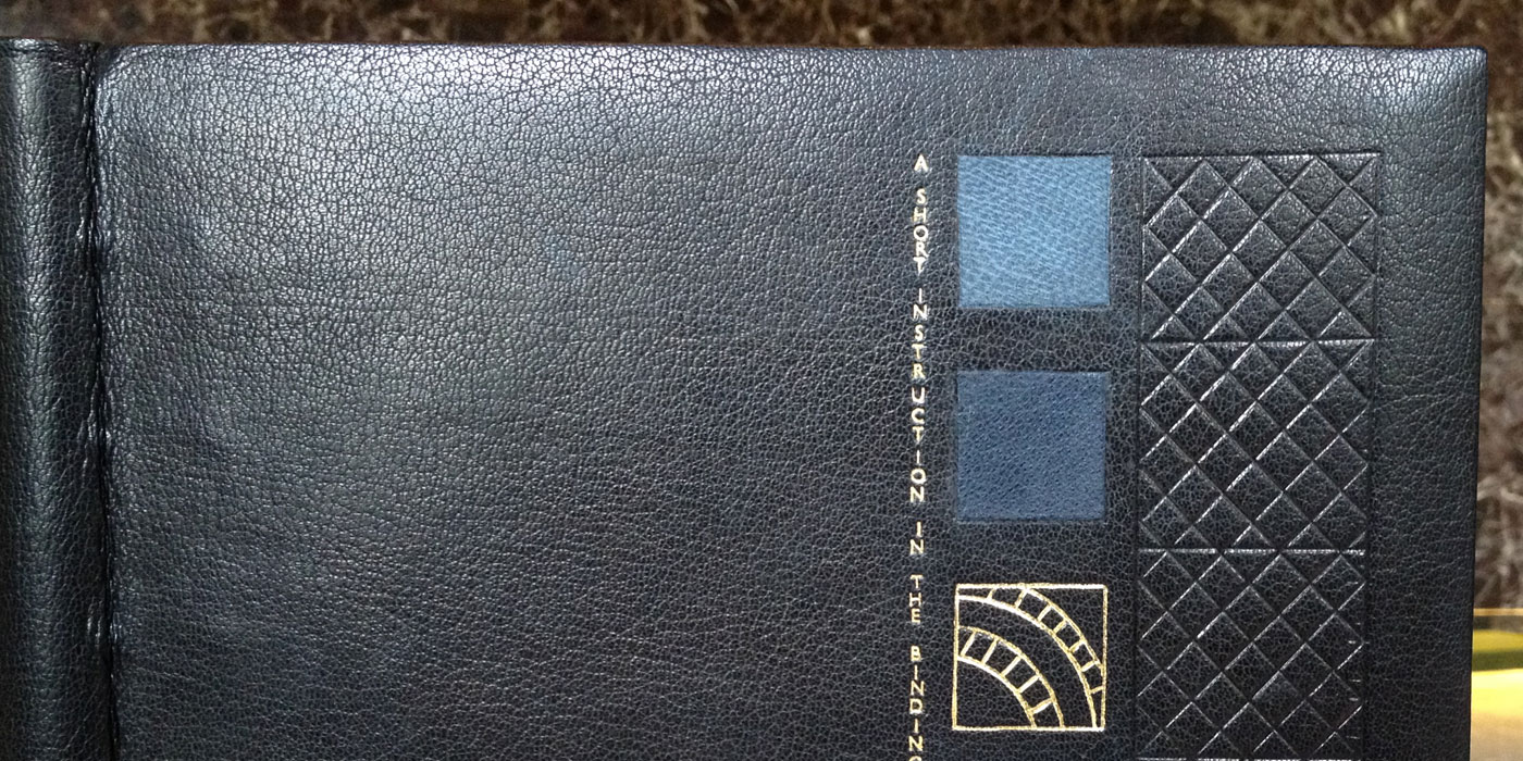
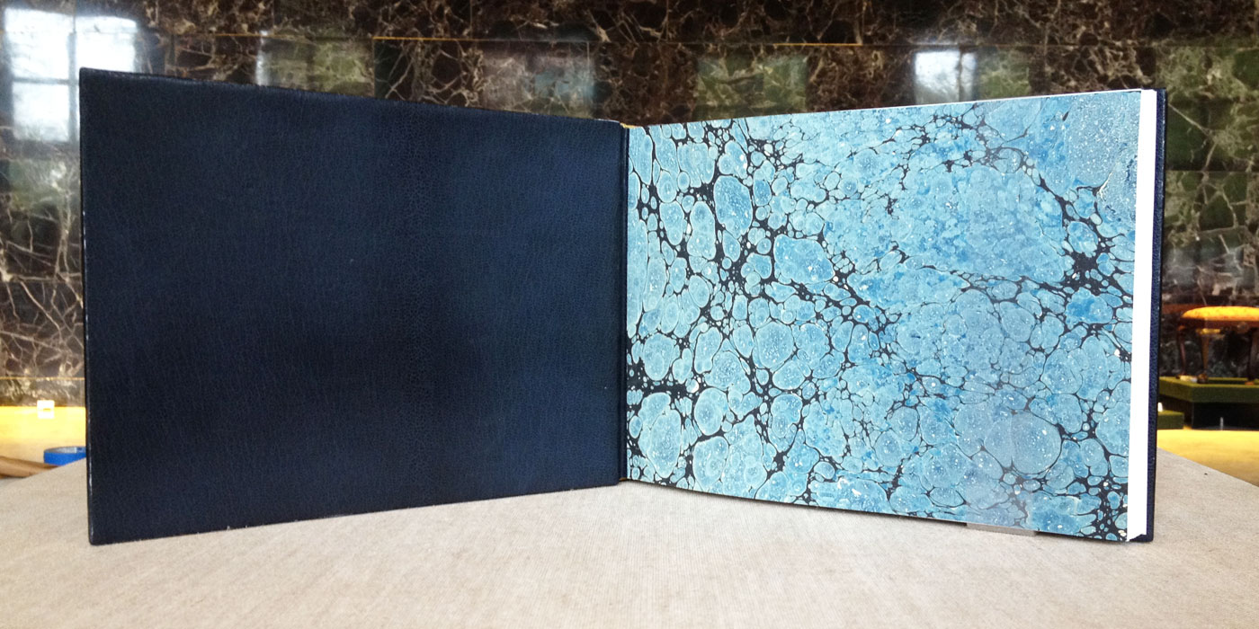
Bound in black goatskin with navy blue doublures. Leslie hand marbled the paper used on the made flyleaf. Pulling from the architectural elements within the illustrations, Leslie has created a complimentary structural design on her binding.
- - - - - - - - - - -
Elizabeth Curran
Elizabeth also found inspiration in the original manuscript illustrations, but put her focus on the illustrations of stacked books to create a design of an abstracted library. The stacked books on her binding are created through a series of gilt line palettes and gouges, with a few being surface gilt. Separating the stacked books are a series of vertical stripes of colored onlays, some being tooled onlays. A nice detail that Elizabeth included, was wrapping the colored onlays onto the board edges.
The design is quite striking and each cover can stand alone or be displayed fully open as the image above displays.
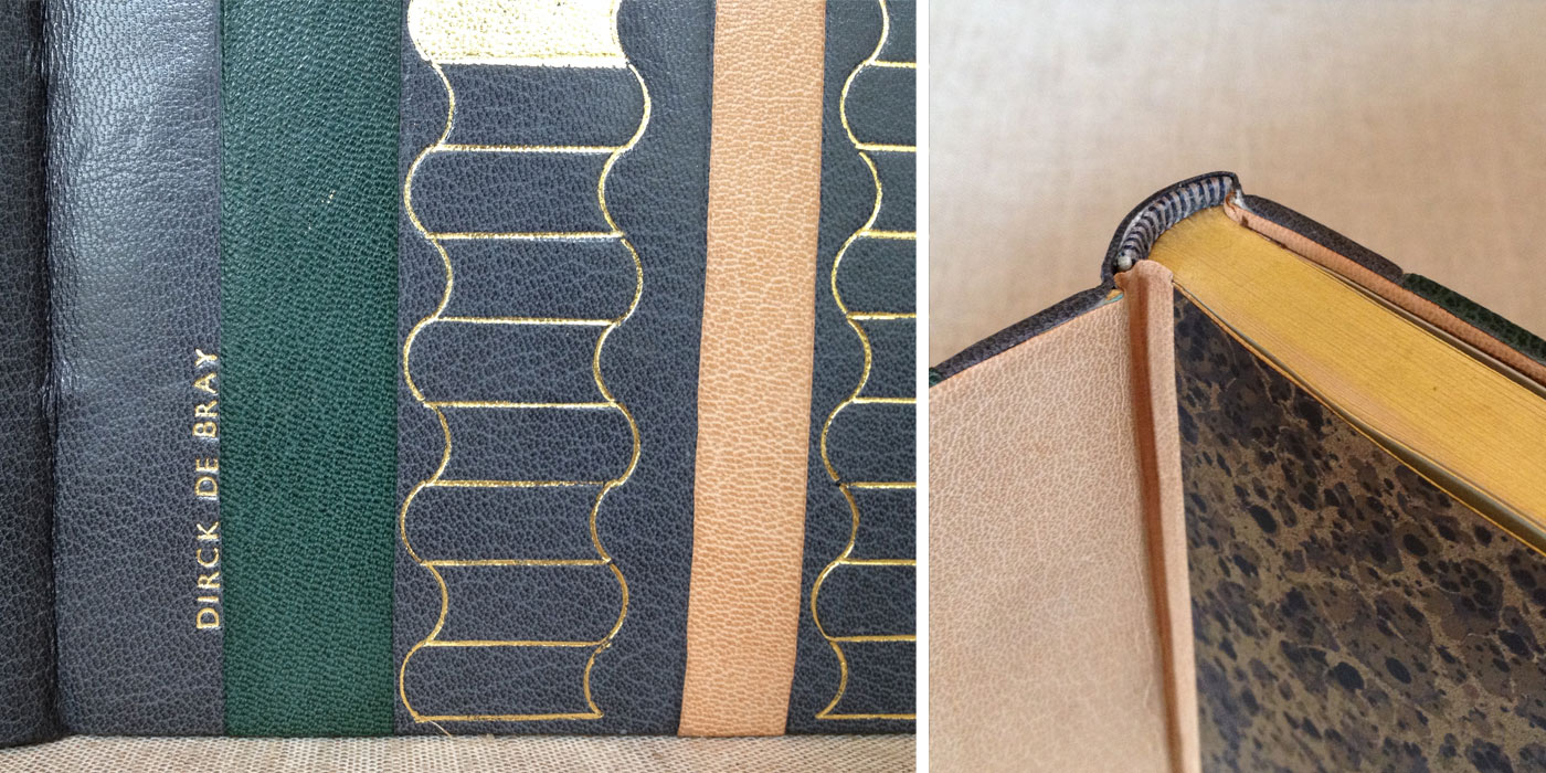
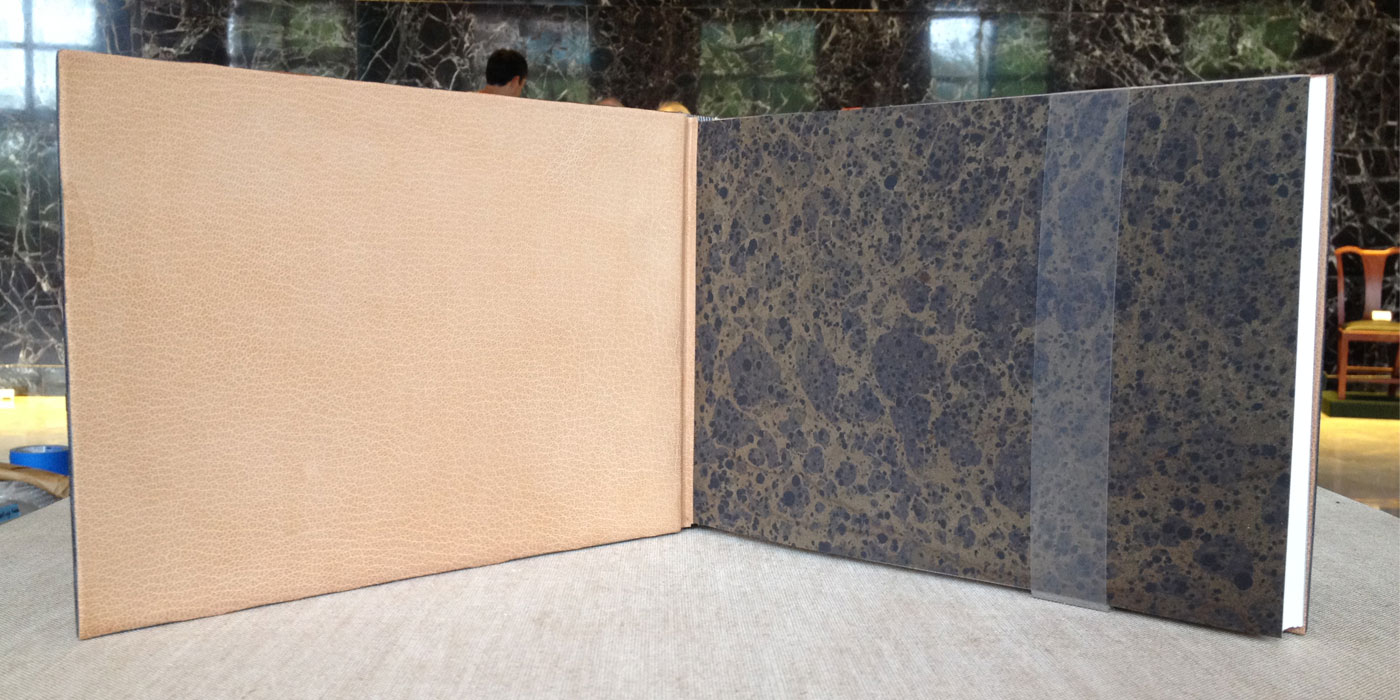
Bound in grey Harmatan goatskin with biscuit-colored goatskin doublures paired with a handmade marbled made flyleaf. The headbands are hand sewn around a flat rectangular core made from laminated goatskin and vellum.
- - - - - - - - - - -
Marianna Brotherton
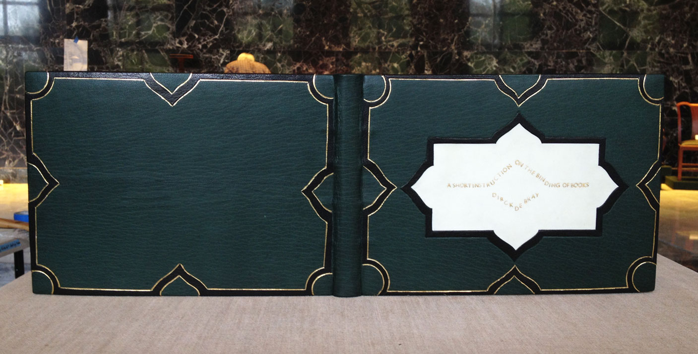
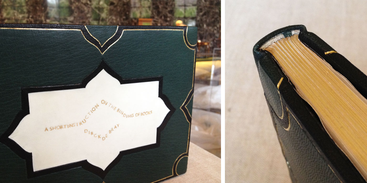
Marianna took her inspiration from designs on mid-17th century bindings, a period that is contemporary to the original manuscript. The frame is created with a black onlay and tooled using an ascona tool over gold foil. The center inlay panel of vellum is framed with a black onlay mimicking the style of the outer border. Marianna wanted to incorporate vellum in her design as a homage to the original vellum binding of the manuscript. The title, along with de Bray's name, has been hand-tooled with gold foil onto the vellum.
Bound in green Pergamena goatskin and vellum with black goatskin doublures paired next to a stunning Claire Maziarcyk paste paper made flyleaf.
- - - - - - - - - - -
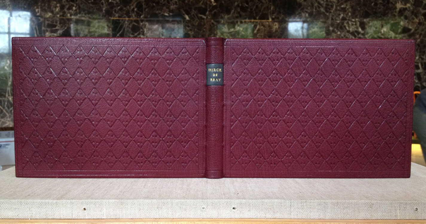
And last, but certainly not least is the binding created by NBSS instructor and alum, Jeff Altepeter. Bound in crimson goatskin with matching doublures. The boards are blind tooled in a lozenge pattern using a single hand-carved finishing tool which mimics the classic 'cusped edge stamp'. de Bray's name is hand tooled on a leather label pasted on the spine. Marbled 'Dutch curl' endpapers in the typical 18th century palette are used for the made flyleaf.