Review by Gabrielle Fox
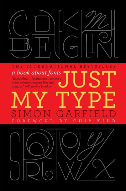
Just My Type: A book about fonts by Simon Garfield with a foreward by Chipp Kidd.
GOTHAM BOOKS Published by Penguin Group (USA) Inc. Hardcover, dust jacket, 5¾ x 8½ inches, 356 pages, U.S.$27.50, Can$32.00. ISBN 978-1-592-40652-4

An announcement of the publication of Just My Type caught my eye (the dust jacket design is striking) and I found myself smiling because it was somewhere out there in the world and not in a book related publication. It looked to be entertaining and informative, so I requested a copy to review.
I was enjoying reading it enormously until I came across another review by Paul Shaw in ‘Inprint-The Online Community for Graphic Designers’ which pointed out, on many occasions, that some of the information wasn’t true. That rather spoiled it and I put the book aside for several weeks, picking it up now and then to read a few pages or a chapter out of order.
Maybe it was Garfield’s humor that got up Shaw’s nose. Most of the time I really enjoyed the way Garfield presented the information and told the stories associated with the design of type. I do though have to agree with Shaw in taking exception to the statement, “And calligraphy is virtually gone, a craft Prince Charles is said to be keen on, hanging on grimly behind glass on the qualification certificates of quantity surveyors and chiropractors.” Shaw’s description is “snotty put-downs.” I just think Garfield is ill informed.
Just My Type is entertaining and informative. Apparently not all of the information is entirely correct, but overall I would say it is enjoyable and certainly taught me more about type design and has given me added reason to appreciate the work involved. This is not a history of type design, but does give historic information through chapters on various designers and observations on major shifts that have taken place as a result of technological changes in print communication.
Through my work as a binder I am aware of type design, but the stories Garfield tells have made me even more aware and did get me thinking of those early days, studying binding. We did so much work then with brass engraved hand held letters which were so incredibly expensive to purchase. Oh the hours we all spent trying to decide what type face to purchase and then what size. And the greatest disappointment was to find that what seemed a fail safe way to title a book, in the type face it was printed in, didn’t always look right or read well impressed with gold on a leather spine. The chapters in Just My Type illustrate similar specific examples of use which explains different typefaces’ use and influence.
This is a great read and will spark your curiosity to continue research. You will find yourself smiling when you pass the next road sign, turn on the computer or go to the grocery. The endpapers are the The Periodic Table of Typefaces and there is a bibliography to begin the list for more information.
I enjoyed this book so much I think GOTHAM BOOKS should publish another version with better reproductions of the examples and double check on the accuracy of all the information!
Gabrielle Fox is a bookbinder trained in England and now based in Cincinnati, Ohio. She is the author of The Essential Guide to Making Handmade Books and is now writing the history of Larkspur Press.
Thanks are due to the GBW Newsletter, where this review was originally published.